top of page
Strategic Design 1
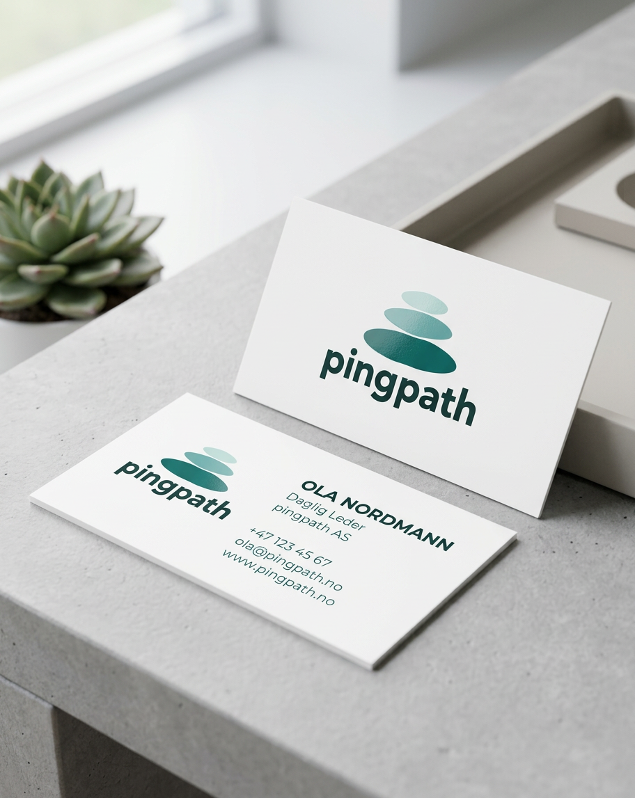
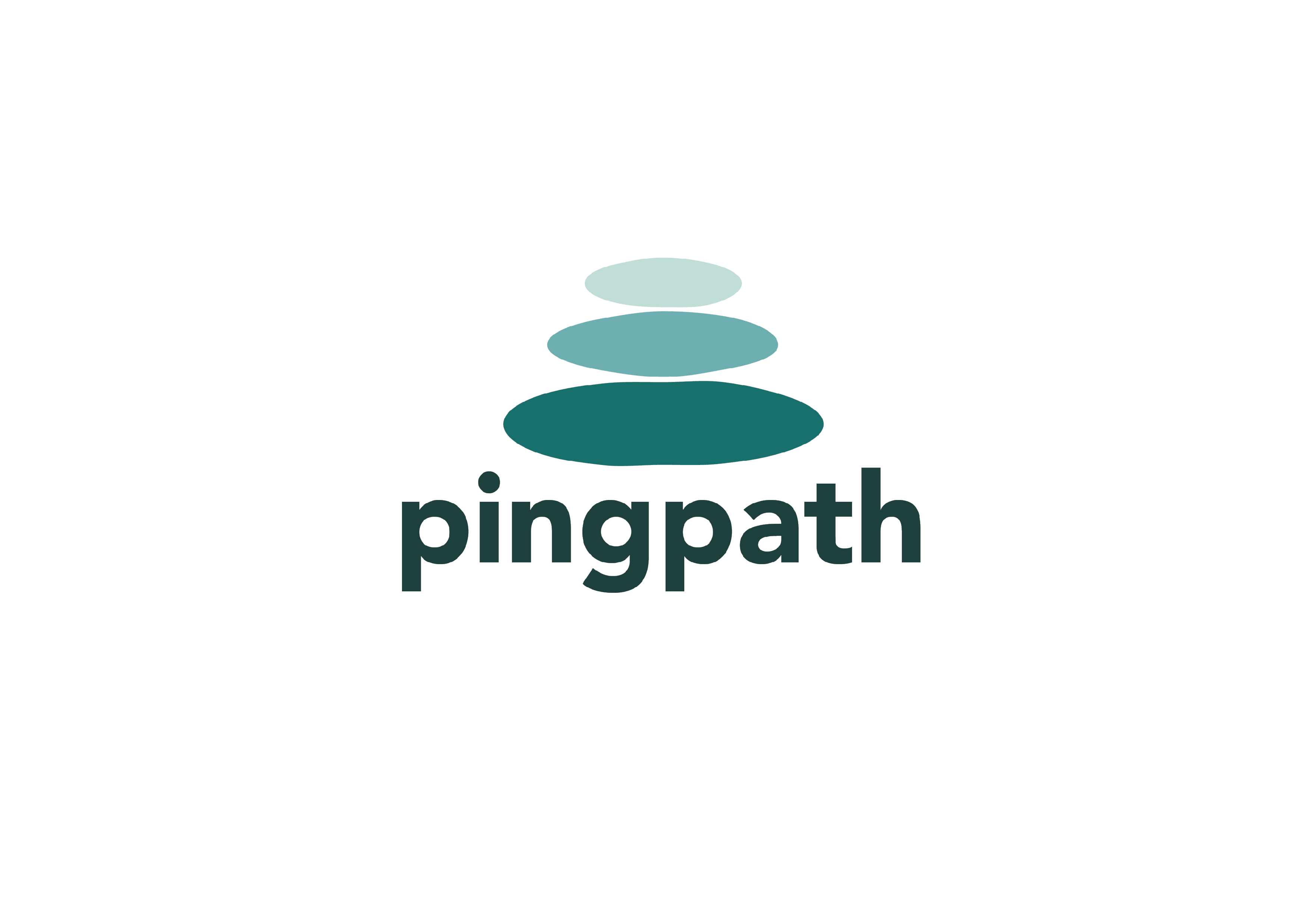
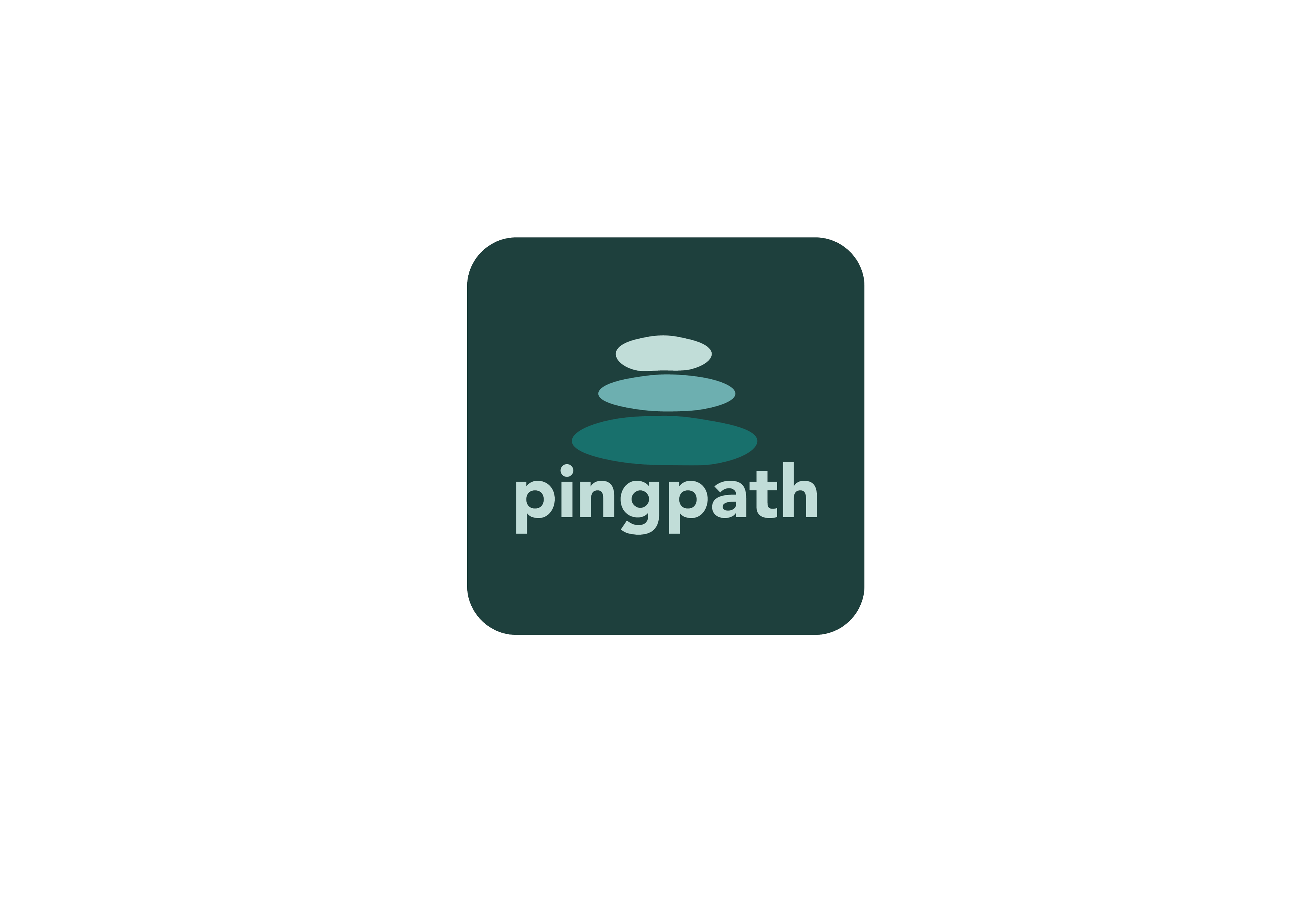
The assignment was to design a logo for the app Pingpath. This was one of six companies to choose from. Pingpath is a focus and habit tracking app for students, developed and tested in Taiwan. The logo is designed to show progress— building step by step and representing different levels of focus. This is illustrated through three organic, elongated circular shapes in different sizes as stones. The shapes symbolize gradual development and progression. Just like building habits, routines must be built step by step. The different color shades of the stones represent different levels of focus. Since the app is designed to improve focus, the variations in color reflect this development.
Projecttype
Logo design for Pingpath
Date
February 2026
Animated logo link

01
Strategic Design 1

01

02

03

04
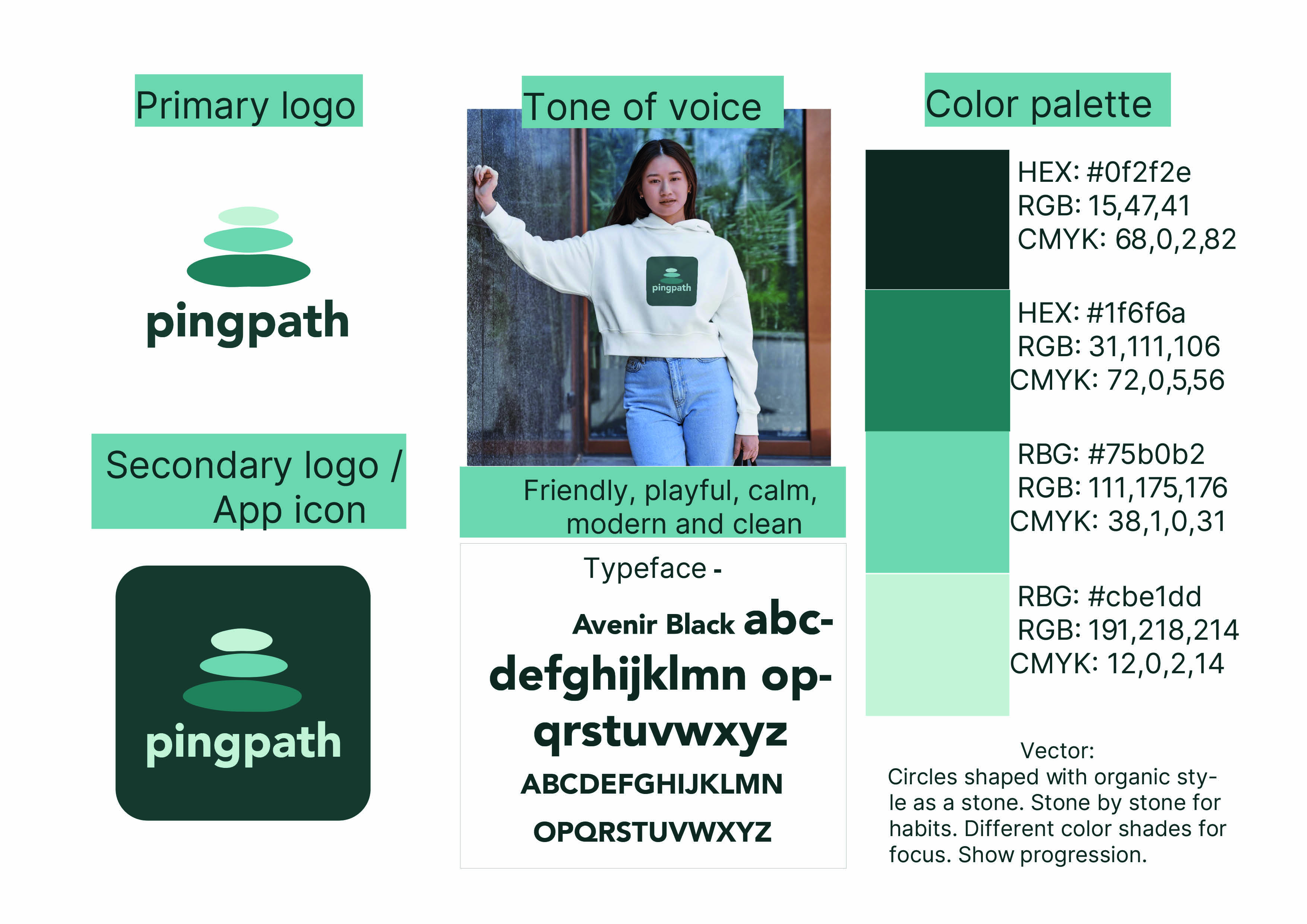
Brand style guide

05
Animated video, please find a link in the info section

06

07



bottom of page