top of page
Home
About me
Portfolio
Portfolio
Please have look at my design projects.
Previous
01
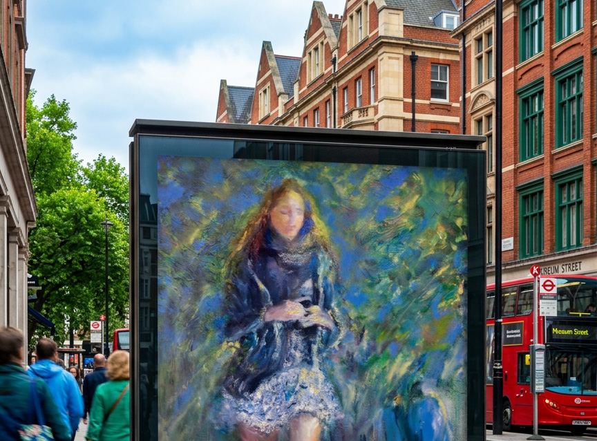
Graphic Design - Not a school project
I was hired by a art gallery to design a poster for an art exhibition.
Format A3 and 50x70cm.
02
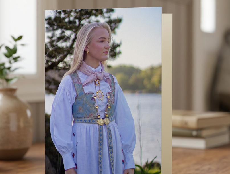
Photography - Not a school project
This is just for my portfolio, not a school project. Photos taken in May 2026. Confirmation, girl 15 years, in South of Norway.
03
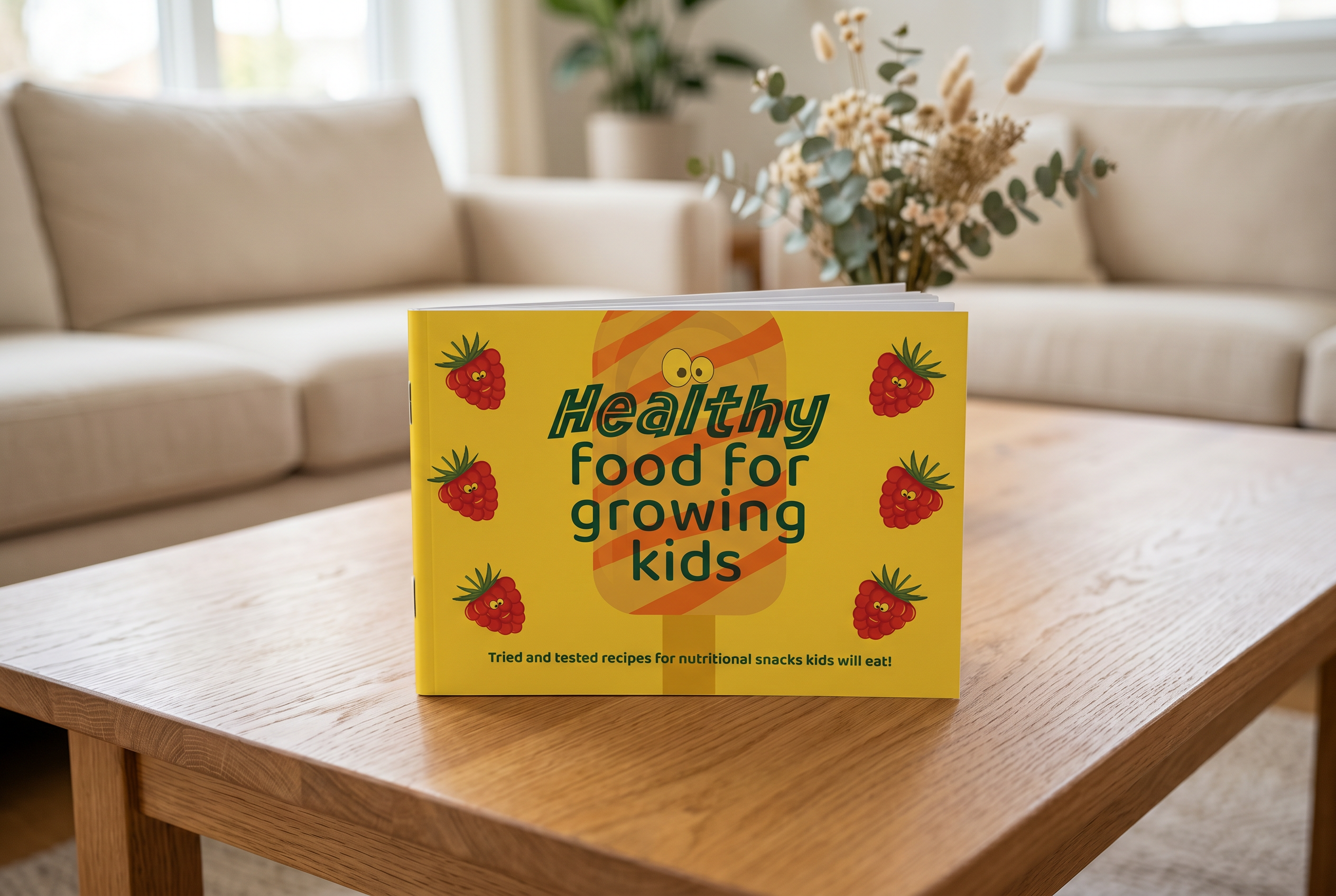
Graphic Design 2
Designing a booklet - cookbook for children - A5 format. We received all written content and recipes for the cookbook and were responsible for the overall book design and visual direction. The concept is a fun and playful cook book for young children. The yellow color used throughout the book creates a warm, child-friendly feeling and a sense of consistency. The book features a variety of warm, vibrant colors and playful cartoons. These cartoons help guide the reader through the book. The goal is to spark children’s curiosity and encourage them to try more recipes and to read.
04
Photography 1
This assignment was to take five different photographs based on different criteria. I chose the criteria of light on light, movement, shallow depth of field, the rule of thirds and contrast. We were required to use a DSLR camera or a mirrorless camera and a tripod, with the best possible lighting. Only using manual settings and no editing allowed. I used my Canon DSLR camera D100.
Camera settings:
Exposure - Light on light:
Aperture f11, Shutter 1/13s, ISO 100
Shutter speed - Movement:
Aperture f11, Shutter 1/20s, ISO 100
Aperture priority - Shallow depth of field:
Aperture f1,4, Shutter 1/320s, ISO 100
Composition - The rule of thirds:
Aperture f2, Shutter 1/25s, ISO 100
Creative - Contrast:
Aperture f5,6, Shutter 1/6s, ISO 100
05
Strategic Design 1
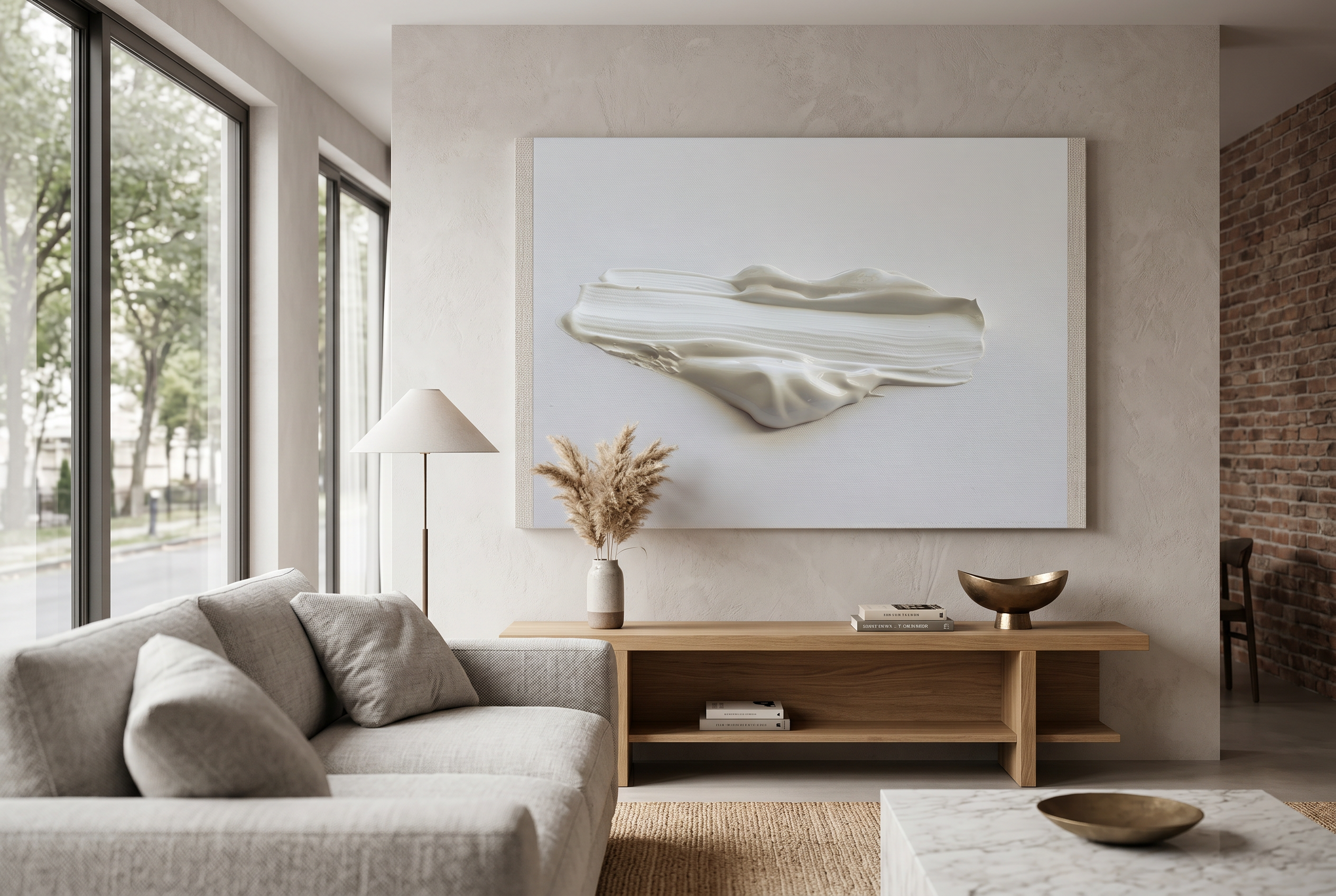
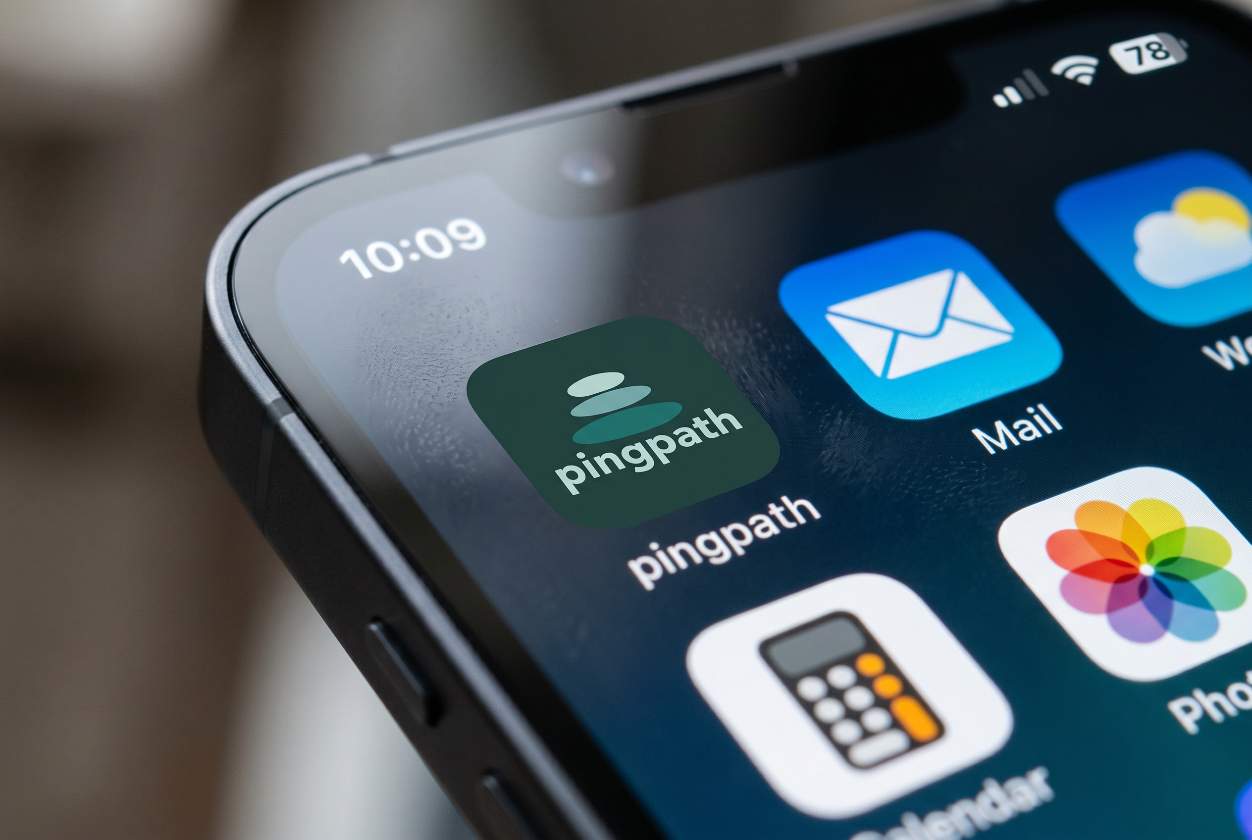
The assignment was to design a logo for the app Pingpath. This was one of six companies to choose from. Pingpath is a focus and habit tracking app for students, developed and tested in Taiwan. The logo is designed to show progress— building step by step and representing different levels of focus. This is illustrated through three organic, elongated circular shapes in different sizes as stones. The shapes symbolize gradual development and progression. Just like building habits, routines must be built step by step. The different color shades of the stones represent different levels of focus. Since the app is designed to improve focus, the variations in color reflect this development.
06
Graphic Design 1
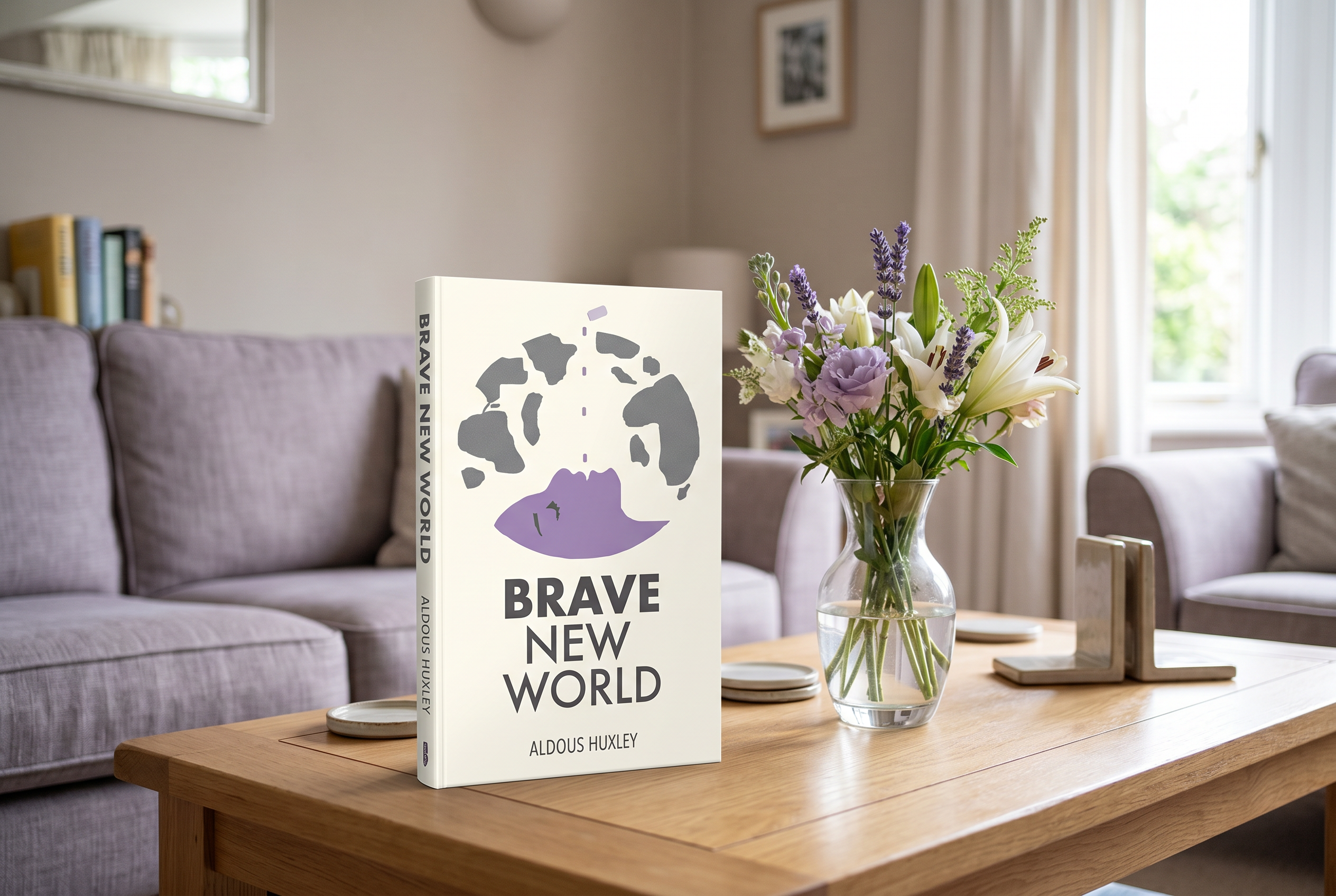
This was my first assignment during my first semester: designing a book cover. I chose Brave New World from four different options. The book cover present a clean and minimalistic style, while also appearing bold. I have applied several Gestalt principles and created strong contrasts, which give the cover a sophisticated look. The woman in the illustration are under control. Her ear is not visible, symbolizing that she allows herself to be controlled. This brave new world feeds her with pills, and this makes her happy. Her closed eyes and the shape of her mouth indicate satisfaction rather than fear. She exists only on the surface. The purple pills colour her face, illustrating the effect of the pills.
Next
01 / 06
Close
Previous
Next
Graphic Design - Not a school project
I was hired by a art gallery to design a poster for an art exhibition.
Format A3 and 50x70cm.
Go to link
01
Graphic Design - Not a school project
I was hired by a art gallery to design a poster for an art exhibition.
Format A3 and 50x70cm.
02
Photography - Not a school project
This is just for my portfolio, not a school project. Photos taken in May 2026. Confirmation, girl 15 years, in South of Norway.
03
Graphic Design 2
Designing a booklet - cookbook for children - A5 format. We received all written content and recipes for the cookbook and were responsible for the overall book design and visual direction. The concept is a fun and playful cook book for young children. The yellow color used throughout the book creates a warm, child-friendly feeling and a sense of consistency. The book features a variety of warm, vibrant colors and playful cartoons. These cartoons help guide the reader through the book. The goal is to spark children’s curiosity and encourage them to try more recipes and to read.
04
Photography 1
This assignment was to take five different photographs based on different criteria. I chose the criteria of light on light, movement, shallow depth of field, the rule of thirds and contrast. We were required to use a DSLR camera or a mirrorless camera and a tripod, with the best possible lighting. Only using manual settings and no editing allowed. I used my Canon DSLR camera D100.
Camera settings:
Exposure - Light on light:
Aperture f11, Shutter 1/13s, ISO 100
Shutter speed - Movement:
Aperture f11, Shutter 1/20s, ISO 100
Aperture priority - Shallow depth of field:
Aperture f1,4, Shutter 1/320s, ISO 100
Composition - The rule of thirds:
Aperture f2, Shutter 1/25s, ISO 100
Creative - Contrast:
Aperture f5,6, Shutter 1/6s, ISO 100
05
Strategic Design 1
The assignment was to design a logo for the app Pingpath. This was one of six companies to choose from. Pingpath is a focus and habit tracking app for students, developed and tested in Taiwan. The logo is designed to show progress— building step by step and representing different levels of focus. This is illustrated through three organic, elongated circular shapes in different sizes as stones. The shapes symbolize gradual development and progression. Just like building habits, routines must be built step by step. The different color shades of the stones represent different levels of focus. Since the app is designed to improve focus, the variations in color reflect this development.
06
Graphic Design 1
This was my first assignment during my first semester: designing a book cover. I chose Brave New World from four different options. The book cover present a clean and minimalistic style, while also appearing bold. I have applied several Gestalt principles and created strong contrasts, which give the cover a sophisticated look. The woman in the illustration are under control. Her ear is not visible, symbolizing that she allows herself to be controlled. This brave new world feeds her with pills, and this makes her happy. Her closed eyes and the shape of her mouth indicate satisfaction rather than fear. She exists only on the surface. The purple pills colour her face, illustrating the effect of the pills.
Graphic Design - Not a school project
Photography - Not a school project
Front cover
Photography 1
App icon
Graphic Design 1
bottom of page